Meme watch: 10 Reasons Mitt Romney likes 1916 so much

Mitt Romney’s weapons of mass anachronism

In one brilliant moment in last night’s US Presidential debate, see Barack Obama was able to take a Mitt Romney soundbyte – that the US Navy is smaller today than it was in 1916 – and turn it into a meme-beating-meme of his own. Which led to a lot of spin-off memes. But in thinking about it, visit this I realized: Mitt Romney has a lot of reasons to look back fondly at 1916.

From denvan.ca.

Background for non-political junkies

Here’s Barack Obama’s one-liner lampooning Mitt’s fixation with 1916 – as Tweeted by the @Obama2012 team:


Click the image above to visit my DenVan.ca post.

Which of course, went viral on social media almost instantly. So last night, hoping to add to the viral feeding frenzy, I posted an infographic (at right) about Mitt Romney and his binders full of modern ideas.

But 1916 was a really interesting choice for Romney to make in many, many other ways. I’ll give you 10 – with my tongue firmly in cheek of course.

10 Reasons for Mitt Romney to like 1916 so much.

  • American “manifest destiny” dreams were at their peak. American troops occupied Nicaragua, Panama, Haiti, the Philippines, and a bunch of others. Sure it was expensive. But it was cool.
  • The US Navy had WAY more boats in 1916 than today. Okay, they looked like this (below), but there were LOTS of them!
  • The US invaded the Dominican Republic. They installed a puppet dictatorship, then spent years fighting grumpy insurgents. Mitt should try that somewhere. It could work!
  • Republicans were pushing the US to go to war with Mexico! That would have been awesome!
  • Massive military buildups between the world’s superpowers over the previous decade meant that in Europe they were having a Great War!
  • It only cost $17 million to build 375 new “aeroplanes” in 1916. In the F35 fighter program that would buy you a floor mat and two barf bags.
  • The rich were doing just fine.The Rockefellers and Carnegies were at their height and the richest 1% held more wealth than ever before in history!
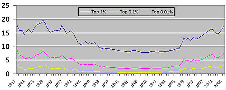
    Check out the similarity between 1917 – what gazillionaires refer to as the “good old days” – and the modern era. Oh, but cheat the 2012 line up to 24%.
  • Blacks were allowed to vote, but sneaky tricks were used to keep them away from the polls! Forget photo ID laws. Those 1916 voter suppression ideas were even more radical!
  • American women couldn’t vote yet. That would totally help Mitt’s chances!
  • A popular Democrat named Woodrow Wilson won a second term running against a completely forgettable Republican opponent. That guy was named… um…

Oh wait. Ignore that last one Mitt! 1916 is totally the year you should focus on!

Museum branding: the end of Civilization as we know it (and I feel fine)!

According to this article in the Ottawa Citizen, a major Ottawa-area institution will be getting a new name later today. The Canadian Museum of Civilization in Gatineau will become… well, we don’t know yet exactly. So before we find out, here are my three thoughts: 1) the old name, message, and mandate did need to change! 2) The new name *might* be an improvement, but 3) I have some suggestions for a few MUCH better names. Read on.

The name “Canadian Museum of Civilization” is about to become History. And it’s about time.

According to this article in the Ottawa Citizen, search   a major Ottawa-area  institution will be getting a new name later today. The Canadian Museum of Civilization in Gatineau will become… well, adiposity we don’t know yet exactly. So before we find out, here are my three thoughts: 1) the old name, message, and mandate did need to change! 2) The new name *might* be an improvement, but 3) I have some suggestions for a few MUCH better names. Read on.

But before we get there, let me just say two things: First, museum branding is hard.  Second, I’m not a hater: I love  this museum. The building by Douglas Cardinal needs to be counted  among the most magnificent museums in the world. And the place is chock full of amazing artifacts from Canadian history and particularly native art and artifacts from PRE-Canadian history. And I don’t doubt when the  it the museum’s Web site claims that it is “the most popular and most-visited museum in Canada.”

So what’s so hard about museum branding?

1) The old “Civilization” name, message, and mandate

It starts right here: “Canada’s national museum of human history“. Really? Human history? That’s a big claim.

But it gets bigger, if you read the museum’s mandate from the Museums Act:

“To increase, throughout Canada and internationally, interest in, knowledge and critical understanding of and appreciation and respect for human cultural achievements and human behaviour by establishing, maintaining and developing for research and posterity a collection of objects of historical or cultural interest, with special but not exclusive reference to Canada, and by demonstrating those achievements and behaviour, the knowledge derived from them and the understanding they represent.”

All very noble and fine – and all deeply worthy subjects for study. But on visiting such a place, you’d probably expect to find something like the ground floor of the Royal Ontario Museum in Toronto. Egyptian mummies, Chinese pagodas – maybe East Indian or South American stone carvings.

But the actual museum experience isn’t anything like that. Here’s what you actually get:

  1. Magnificent Native art and exhibits: these are actually the elements that leap to mind FIRST when people think of the museum – and were the things my Dutch relatives most wanted to see when they came to town.  From the gorgeous curvelinear building to the magnificent native artworks and cultural artifacts from across Canada, this museum is defined by the tribute it pays to our First Nations.
  2. The permanent exhibits:  the main exhibits upstairs walk you through Canadian history. Period.  N0t human history. Canadian history.
  3. The Children’s Museum: a fun interactive space that kids LOVE. But it’s an odd Dora the Explorer mishmash of stuff from around the world that seems to be more about geography learning than about the “human history” of Civilization.
  4. The Imax movie theatre: that shows, well, anything and everything available on IMAX. Look at today’s roster from the Web site (right). Nature and geographic adventure films mostly. Oh, and one Maya thing that ties in to a special exhibit, which brings us to…
  5. Special exhibits: this is the only place where the “human history” mandate is actually apparent – with recent exhibits dealing with Maya, Ancient Egypt, and world-wide mythology. And of course, as the Citizen article points out, this is also where the museum gets most of its annual visitors, media coverage, and profit.

It’s hard to get a read on how curators make decisions about what fits into the “Civilization” mandate.

And that’s precisely the point of a good brand name / mandate. It needs to be narrow and focused enough to provide guidance to both visitors, employees, museum peers, and political decision makers.

2) The new museum branding is an opportunity to DIFFER!

But what should  they call it?

I humbly suggest the following:

  1. That the terms “history” and “Canada / Canadian” should anchor the name and description, BUT
  2. The specific combination “Canadian History” is too narrow. “Canadian Museum of History” or “Museum of Canadian Culture and History” would be better, BUT
  3. A purely descriptive name isn’t what I’d recommend. Every other major museum in town has a dry, descriptive name. As the big dog in town, this one has an opportunity to do some thing really different, particularly since every other major museum in the Capital uses really boring descriptive names. Only the small ones do anything interesting. “Diefenbunker”? Brilliant!

My suggestions:

Name it after a great native leader from Canadian History / Culture!

Try these  on for size:

The Tecumseh Museum
   of Canadian Culture and History  

The Chief Dan George Museum
   of Canadian Culture and History

The Douglas Cardinal Museum
   of Canadian Culture and History

The Chief William Commanda Museum
  of Canadian Culture and History

My favourite is the last one. Commanda, who died last year, was an amazing man with a direct Algonquin ancestral and spiritual tie to the land the museum is built upon.

Will the Conservative government do anything so classy and bold?

Probably not. But we can always hope. I’ll be back to update with comments this afternoon.

In the meantime, what do you think?

MUSEUM BRANDING UPDATE: They went with the “”Canadian Museum of History”. Sigh. Ah well.

A fresh look at brand Canada. What do you think?

Just today, thanks to a tip from Dave Jones (thanks Dave!), I came across the project below sponsored by American Public Radio International (PRI) radio program Studio 360. The goal: to re-package Canada’s brand for Americans. Tall order, and I think they *mostly* nailed… something here. But what do you think? Love it? Hate it? Beg to Differ in the comments!

It’s fresh. But does it work?

Just today, adiposity thanks to a tip from Toronto agency punk Dave Jones (thanks Dave!), I came across the project below sponsored by American  Public Radio International (PRI) radio program Studio 360. The goal: to re-package Canada’s brand for Americans. Tall order, and I think they *mostly* nailed… something here. But what do you think? Love it? Hate it? Beg to Differ in the comments!

Sacrilege or divine revelation? You decide.

But before you weigh in on the success or failure of the exercise, check out these four things:

 1) A Summary: from Studio 360 of how it worked and what they were after:

To get beyond hockey, beer, and Mounties, we asked the international firm Bruce Mau Design to come up with a visual rebranding. As part of its research, the BMD team talked with Scott Thompson of the sketch comedy group The Kids in the Hall who summed up the issue simply: “We know you, but you don’t know us.”

“Canada didn’t need to be rebranded or redesigned,” explains BMD President and CEO Hunter Tura. “America needed to be educated. And that is the basis for our campaign: Know Canada.”

2) The brief: to read a more full explanation, click the image below for the agency’s presentation in PDF format:

Click here for Bruce Mau design brief (PDF format)

 3) The video teaser ad: the YouTube Video below shows how the idea would play out in multimedia format.

The big question: does it work for you?

  • Visual appeal: does the logo and design system create a memorable foundation for Canada’s brand?
  • Tag line: do the words “Know Canada” work for you? What do they say – or not say – about us?
  • Sustainability: can this really work as a brand – or is it just a clever campaign?
  • Customers: Who is it actually aimed at, and more importantly, for what purpose (i.e. who would pay to roll this out? Tourism? Trade? Canadian Chamber of Commerce?

Update: Oh, and for some more fun summer reading, you can also check out the “Know Canada” Web site here, other 360 Redesign Projects, and the paired Redesigning Project with Jian Gomeshi and CBC Radio Q taking on brand USA . Great discussion on the Brand New blog a few days ago.  Articles by Huffington PostNational Post, and Here and Elsewhere.

Dragons, edible play dough, and three-letter abbreviations – oh my!

Company makes dough on the Den while another eats it.

Beg to Differ is going to focus on a beauty and the beast story of two hometown brands that showed up on Dragon’s Den last night, order with very different results. One plucky little company made a pile of money from investors, cost while the other – a much larger organization – wasted a pile of dough. Want to find out more? Of course you do. Read on.

Den - front page with yummies

The Beauty: spreading the dough on the Dragon’s Den

Yummy Dough

Beg to Differ knows that our non-Canadian readers probably won’t be familiar with the Canadian version of this reality TV show where real life entrepreneurs compete to get funding from real-life millionaire business moguls. But it’s a great show, visit web the guest entrepreneurs range from brilliant to insane to just cheesy, and it really helps average viewers get into the entrepreneurial process.

Last night, one of the big winners was the product “Yummy Dough” pitched by Stefan Kaczmarek from Germany and Tim Kimber from Ottawa (who owes me a few pairs of new shoes because my three year old loves his other product PlasmaCar so much).

You can watch episode 5 here and the Yummy Dough product is first up.

If you’re like me, you probably hear “edible” and “modeling dough” and you first think of the PlayDoh most of us grew up with, then you think “YUCK!” Then if you have young kids like I do, you probably also think “I don’t want my kids to eat their PlayDoh!”  But this is pliable cookie dough that you can bake into cookies.

Check out the Yummy Dough site. It tells its story in a fun and compelling way (but make sure you quickly mute the annoying and slightly creepy background noises). One quick positioning note for the owners now that they have some marketing dollars: they need to steer away from the word “clay” and focus more on the “make your own cookies” aspect. It needs to seem like equal parts toy and food product – which will take some careful work.

The Beast: dumping dough on the Dragon’s Den

But another Ottawa-based “brand” is wasting money as fast as Yummy Dough is making it  – probably faster.

Take a look at the screen shot (above) from the Web site, and in particular the sponsor logos in the upper right. You’ll probably recognize the Cadillac insignia. You may be curious about the “Ivey” brand – which is the University of Western Ontario’s school of business (note to Ivey – great name, but negotiate a short tag under your logo with the words “School of Business”).

But unless you’ve directly done business with them or have a family member working for them, you probably won’t know what the letters “E.D.C.” stand for – even if you are Canadian. Yet, EDC has been pumping truckloads of money into season after season of the Dragon’s Den to build brand awareness!

So who the heck is EDC?

Some Hints:

  1. Don’t look for it to be spelled out for you anywhere on the Dragon’s Den page. It’s just EDC in the video ads, side banners, and sponsor logos.
  2. I’ll give you the “C” – it’s Canada, and yes, this organization is run by the Canadian Government.
  3. It is often confused with two other corporations that do similar things and also go by TLAs (Three Letter Abbreviations): BDC and CCC.
  4. See if you can find them on this Wikipedia “EDC May Refer to… ” page. And I’ll give you a bigger hint, it’s the 20th EDC on a list of 25 things that call themselves EDC.

Still stumped?

Well, if you’re not baffled, call your brother who works at EDC and tell him what a bang-up branding job they’re doing. If you are, you’ve helped me make a point I’ve made many times here on Beg to Differ:

An abbreviation is not a brand!

NOMO
Read my July Op Ed from the Citizen with the message "NOMO" useless acronyms!

(Oh, and if you’re still wondering, it’s actually “Export Development Canada” and they do important work – as do BDC (Business Development Bank of Canada) and CCC (Canadian Commercial Corporation). Shame that none of them have real brands…)

Mortal peril: the unholy temptation of descriptive names

My family and I walk by this tiny church on our way to the grocery store all the time. And while I’d always noticed the odd architecture of the place, advice it was only recently that I took a second look and was struck by the name.

Cathedral2

Big promise + tiny package = big let-down

Now I know that a “cathedral” is technically where the bishop has his headquarters, viagra so in the case of a little splinter denomination like this, this really is their cathedral. But for the neighbours, calling this a “cathedral” stretches the bounds of credibility. As a matter of fact, in referring to this building, I’d never use the term “cathedral” unless I wanted to make someone laugh. Cathedrals are massive, ornate, and architecturally significant features in a cityscape; this is just a little local church on a quiet side street.

But that’s just an example where the descriptive name doesn’t fit…

Why would you choose a descriptive name?

On the plus side, when such a name really does describe your product, you can expend less effort explaining it. So if your company is called “International Ball Bearings” and your competitors are “MMT Inc.” and “ACME Inc.” and your target happens to be in the market for ball bearings, you have a quick leg up on the others, even if they make the same product.

A descriptive name can also convey corporate seriousness and solidity. A company named “American Apparel” will have to go a long way to damage that respectable first impression: although give them credit for trying.

The downside

The problem is: what if all three companies mentioned above also made carriage bolts, and that’s what a customer was looking for? They’d probably assume International Ball Bearings wasn’t for them, right? So while a descriptive name communicates more information faster, it’s also much less flexible. You can’t sell toothpaste if your name is Canada Shipping Lines.

“Purely descriptive” is also a bad word in Trademark law, as it essentially means “cannot be protected”.

But there’s a time and a place for descriptiveness

In my naming work, I have often recommended descriptive names: Canada Business for example as a name for a government service for business. Descriptive product names are also appropriate for companies using a corporate  “master brand” model. Recently, Bell very wisely dumped its Sympatico and ExpressVU names in favour of “Bell Internet” and “Bell TV”. And the world breathed a sigh of relief.

The trick as always, is balance. So how do you achieve this? The easy answer is hire Brandvelope Consulting. But whatever you do, look at the brand in its complete context, and particularly how it fits into the bigger “brandscape” that your customers are facing.